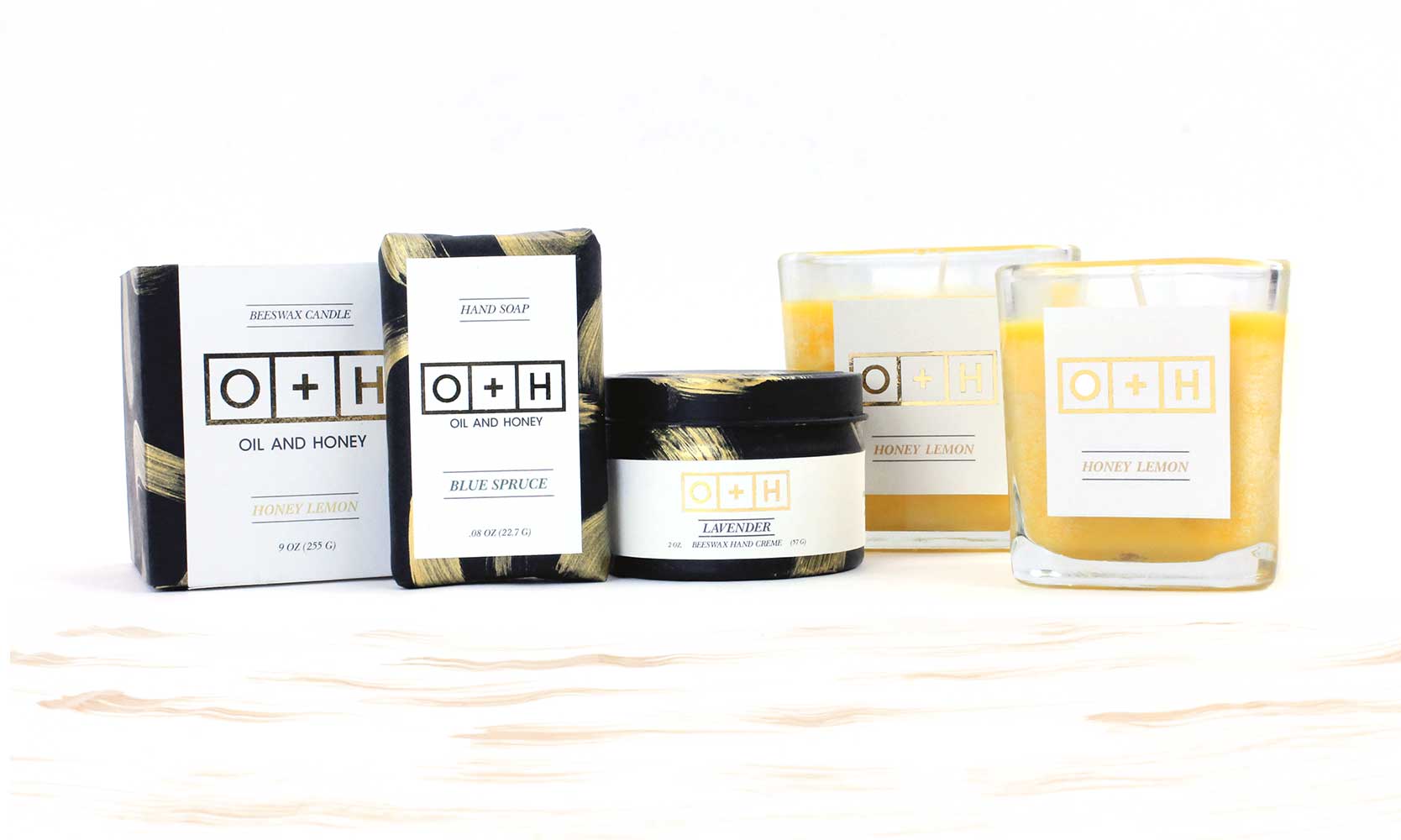
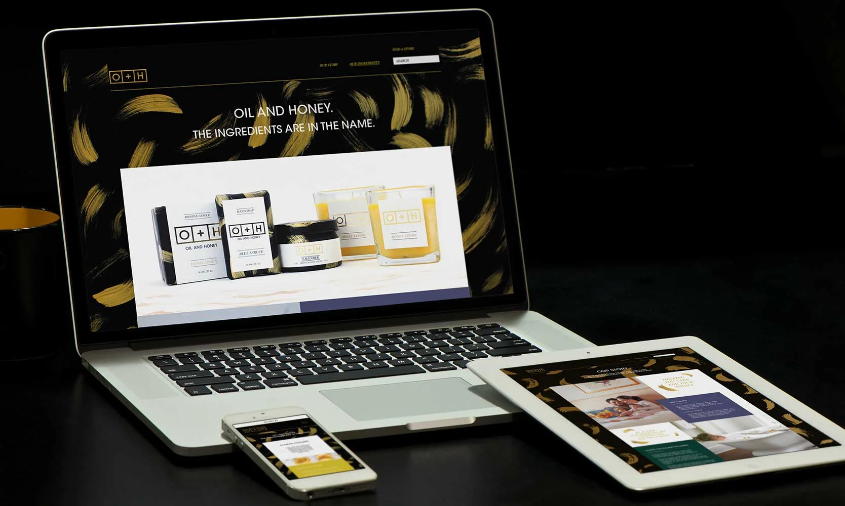
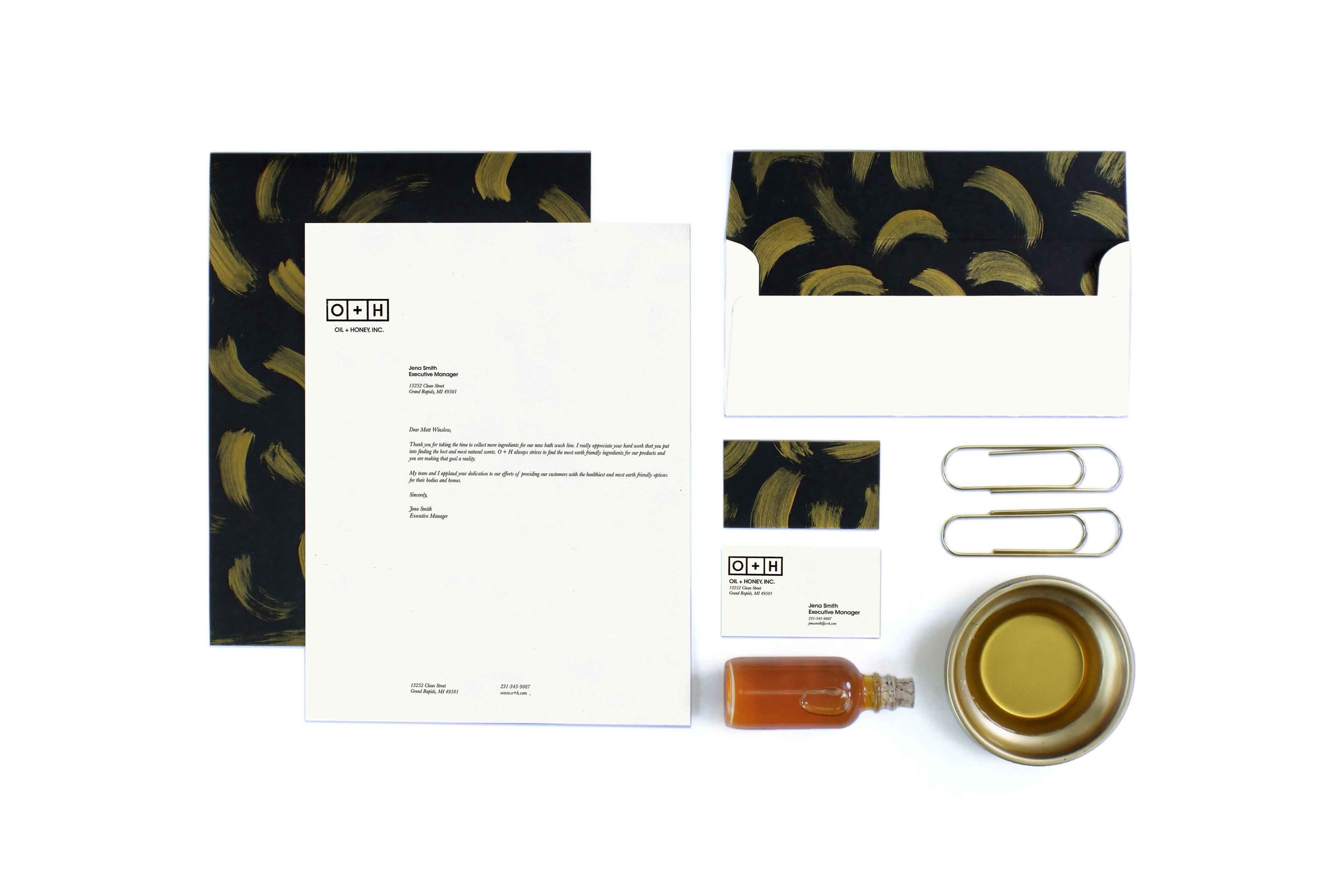
oh_thumbnail.jpg

O+H


O+H

This was a class project that consisted of creating the branding and packaging for an eco-friendly cleaning product. After researching sustainable ingredients that go into earth-friendly product, I used the fact that oil and honey were used in most eco-friendly products. I combined the structured, scientific side of the creation of cleaning products with an elegant and modern style to target my specific user. 


packaging_03.jpg


IDENTITY

The clean structure of the logo was chosen to represent the simpleness of the ingredients used in each product. Then to represent the organic materials, I used the gold and natural brush strokes to mimic the oil and honey ingredients

PACKAGING

The packaging was made with various materials but is consistent by implementing the same brand standards throughout. For the gold effect on the packaging, I ran the logo printed with toner ink through a laminator to transfer the gold foil onto the paper.

web_01.jpg

WEB DESIGN

The web aspect of the company was created to inform customers of the story behind the business and to inform them of the products and where they are available.


packaging_01.jpg